Your “unlimited AI” plan still gets a bill
One subscription can accidentally fund dozens of workloads. Before promising unlimited AI, connect pricing, account ownership and usage rules in the product.
Read the articleU MAD, BRO? Your customer found the cancel button. A screen-by-screen teardown of cancellation friction, misleading retention numbers and the engineering needed to let people leave.
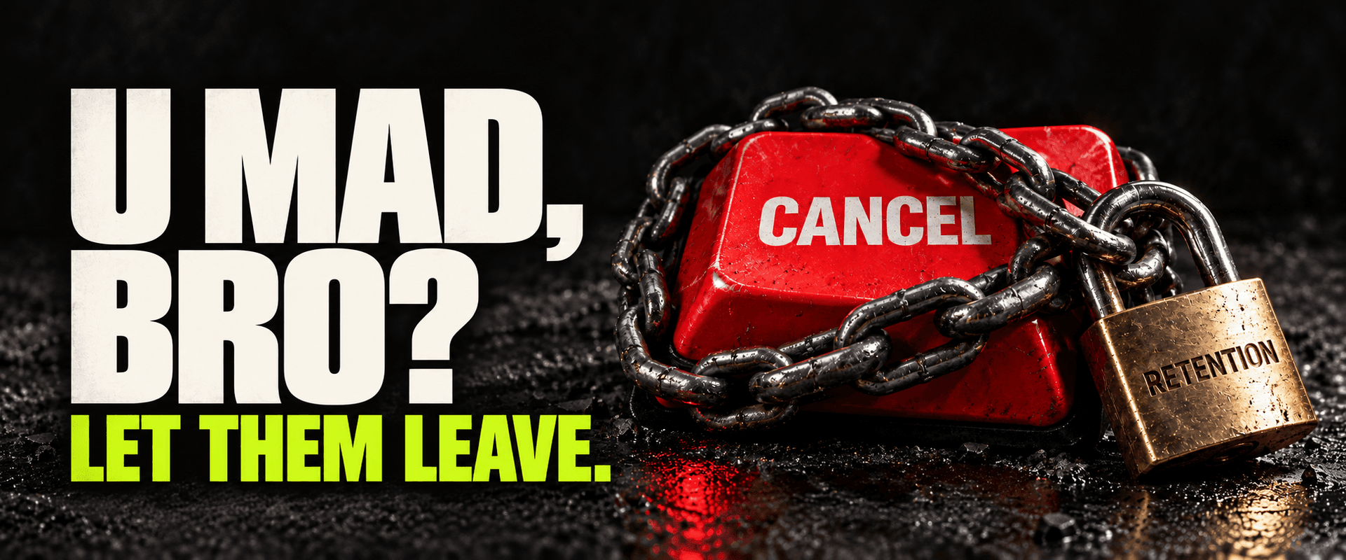
U MAD, BRO? Your customer found the cancel button.
If making that button easier to find threatens your business, there is something uncomfortable worth discussing before your next growth meeting.
You can build an excellent product and still lose customers. Budgets change. Projects end. Someone buys more software than they need. A cancellation does not automatically mean the product failed.
But deliberately exhausting someone until they abandon the cancellation tells you very little about whether they want your product. Calling that person “saved” gives a miserable interaction a flattering name.
Here is a fictional cancellation walkthrough. No client story, no invented conversion numbers. Just a few screens that expose the difference between helping a customer reconsider and wearing them down.
The upgrade button lives in the main navigation. Cancellation lives under Settings, then Account, then a billing page that tells you to contact support.
The customer has already made the decision. Your interface has assigned them an administrative task.
A business can have legitimate contractual terms or account permissions to check. Those should be explained clearly. They should not be discovered halfway through a maze that looked like a self-service subscription when the customer signed up.
Put renewal management somewhere a paying account owner would reasonably look. Say what the action does. “Turn off renewal” can be more accurate than “Delete account,” and confusing those two actions creates a problem before anyone reaches the confirmation screen.
This concern predates the latest growth playbook. The UK Competition and Markets Authority’s 2022 evidence review discusses unnecessary cancellation friction and distinguishes it from friction that helps people make informed decisions. That distinction matters: a warning about consequences can help; a deliberately obstructive route serves a different purpose.
Imagine the next screen offers two choices: “Keep growing” and “Give up on my business.”
Someone hired a writer, approved a design and shipped that sentence. The customer only wanted to stop paying for a tool.
Offer a cheaper plan if it fits. Offer a pause if the customer is between projects. Explain a feature they may have missed. An honest alternative is useful when declining it is straightforward.
The problem begins when every decline opens another pitch, or an optional reason becomes a mandatory essay. You are asking for feedback from a person whose time you are currently wasting.
Ask the reason after you have respected the decision. A customer who can leave freely has less reason to pick a random answer just to escape the form.
This is where the engineering deserves more attention than the button colour.
Suppose a monthly subscriber turns off renewal halfway through a period they have already paid for. Does access continue until the end? Will outstanding usage produce a final invoice? Can they export their work? What happens to the other people in their workspace?
Write those answers on the confirmation screen, then make the software honour them. A friendly message is worthless if the payment system and your application disagree.
Stripe’s cancellation documentation, for example, supports immediate cancellation or cancellation at the end of a paid period. It also describes subscription events and outstanding usage or invoice items. Those capabilities still need to be connected to your application’s access rules and customer messages.
For the fictional subscription here, the confirmation could say: “Renewal is off. Your team keeps access until October 31. You can export your data here.” If a final usage charge applies, explain it alongside that message. Do not promise there will be no more charges unless the billing rules actually support that promise.
Then test the awkward cases: a delayed billing event, a double click, an owner cancelling a shared workspace, a failed confirmation email. Keep a record support can inspect. Make account deletion a distinct, clearly explained choice.
None of this requires making cancellation reckless. Checking that the person has billing authority is sensible. Showing the access end date is sensible. Making them book a sales call to switch off a self-service renewal is a choice you should be prepared to defend.
A person entering the cancellation flow and leaving without cancelling is an ambiguous event.
They might have chosen a better plan. They might have been interrupted. They might have given up. If the dashboard labels all three “retained,” it hides the very difference your product team needs to understand.
Record an accepted pause or plan change separately from an abandoned flow. Look at subsequent product use, completed cancellations, billing complaints and support contacts. Use that evidence to judge whether a retention offer helped.
I would expect a simpler exit to make some cancellations happen sooner. That is a hypothesis to measure, not a promise that easier cancellation magically increases revenue. You may also learn that a feature, price or onboarding problem needs attention. Hiding the exit does not resolve any of those.
The position is simple: if someone wants to stay, give them a good reason. If they want to leave, process the decision accurately. Your product should be able to survive an accessible Cancel button.
If your subscription flow depends on support manually untangling billing and access, Rosecraft can help with the application and integration work: renewal controls, billing events, workspace permissions and clear customer confirmations.
Ready to hear what your product needs, even when it is uncomfortable? Send us your product URL and tell us where customers get stuck. We can discuss the work needed to make that flow behave properly. Please leave customer records and payment details out of the initial message.

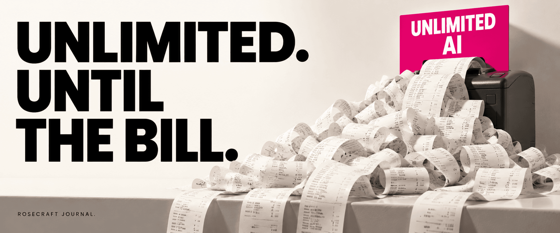
One subscription can accidentally fund dozens of workloads. Before promising unlimited AI, connect pricing, account ownership and usage rules in the product.
Read the article
Beautiful charts can leave expensive work unfinished. How to tell whether your business needs another dashboard, a better integration or a smaller change.
Read the article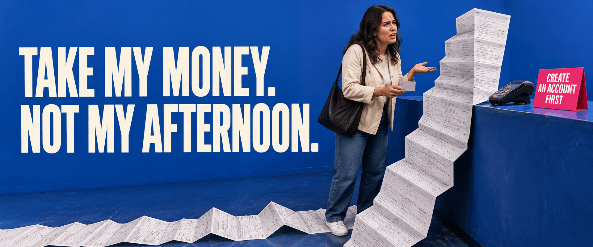
Before paying for more traffic, check what you make willing buyers do. When accounts help, when guest checkout makes sense, and how to find the friction.
Read the articleWith your permission, Google Analytics helps us understand which pages people visit. Analytics cookies stay off until you accept. You can change this in Cookie settings.